Yeah, I wanted to see what you'd say (or not say) about the blinking cursor! 
Changed it, I think this is what you meant. All I did there was moving the CSS from the Code Block into Custom CSS and changing width from 0.5em to:
width: 0.1em;
Being a movie with Matthew Broderick, I've got no clue if I watched it or not, but it's on my watchlist now.
And I wasn't very clear about the hovering, but I meant I did remove it completely. If you also feel like it's good this way, I was finding the hovering too bothersome so I do agree it's probably better off without it!
The mouse cursor not changing before moving the mouse I haven't noticed before but looks like it's a browser issue. In fact, after a while it just stopped happening here (maybe that's why I haven't noticed it). But then I can see the same issue on Safari now. I'll investigate more and get back to you.
We can easily change the cursor icons. It's just a matter of throwing the images there. I've added a link to them under cregox pages. You can just change those link files to change the cursor. 
As for implementing this new design, it would be quite tricky, and I'd need to charge more. I gave it a good shot, but it's just not that simple.
Tweaking the gallery image to fill up the screen like that is more complicated than it may look, by just handling the pre-formatted HTML which is all we can do.
The hardest part, however, is probably the new text placements... It'd also be a lot more hackish to input data than what it is now. Now you simply add title and text as you wish. On the new one we'd need a separated subtitle and a contact info area, which don't exist. One option would be choosing a few special characters. In any case all that sums up to a lot more work.
And it would be also hard to make it responsive. Picture reducing the screen size down to 320px for iPhone 4. I can't even picture it right now.
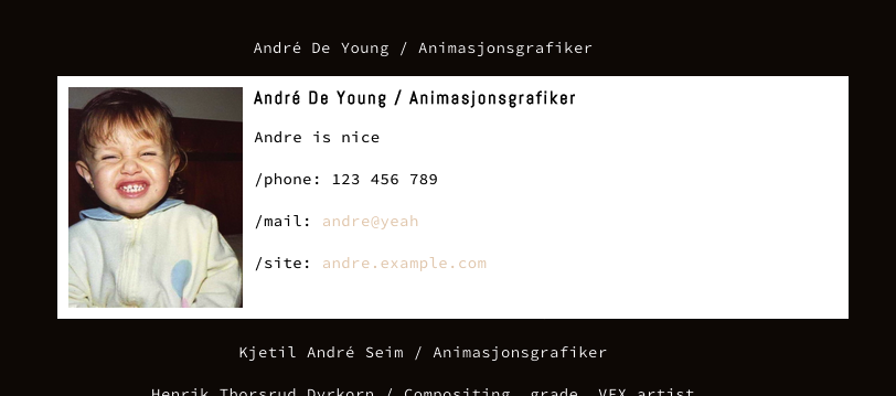
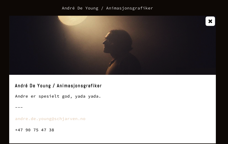
I see there's no more icons (magnifying glass on the first-click and X on the second), though. Is that on purpose? Removing them would be very easy, but I think it would be a worse UX on mobile. It's already not clear we can click on names there.
In any case, see if you like what I've made so far or if you rather I revert it back. This current design also work without a problem on smaller screens:
We can easily change the font if it's a web font. I just have no clue on fonts or which one you're using.